EmpowerHer

EmpowerHer is a campaign concept about the quiet ways women are sometimes taught to compete with each other, judge each other, or tear each
other down.
I did not want the campaign to feel soft just because the message was about support. That felt too easy, and honestly, not honest enough. The issue itself has tension. It can be subtle, emotional, and uncomfortable, so the design needed to feel strong without becoming harsh or accusatory.
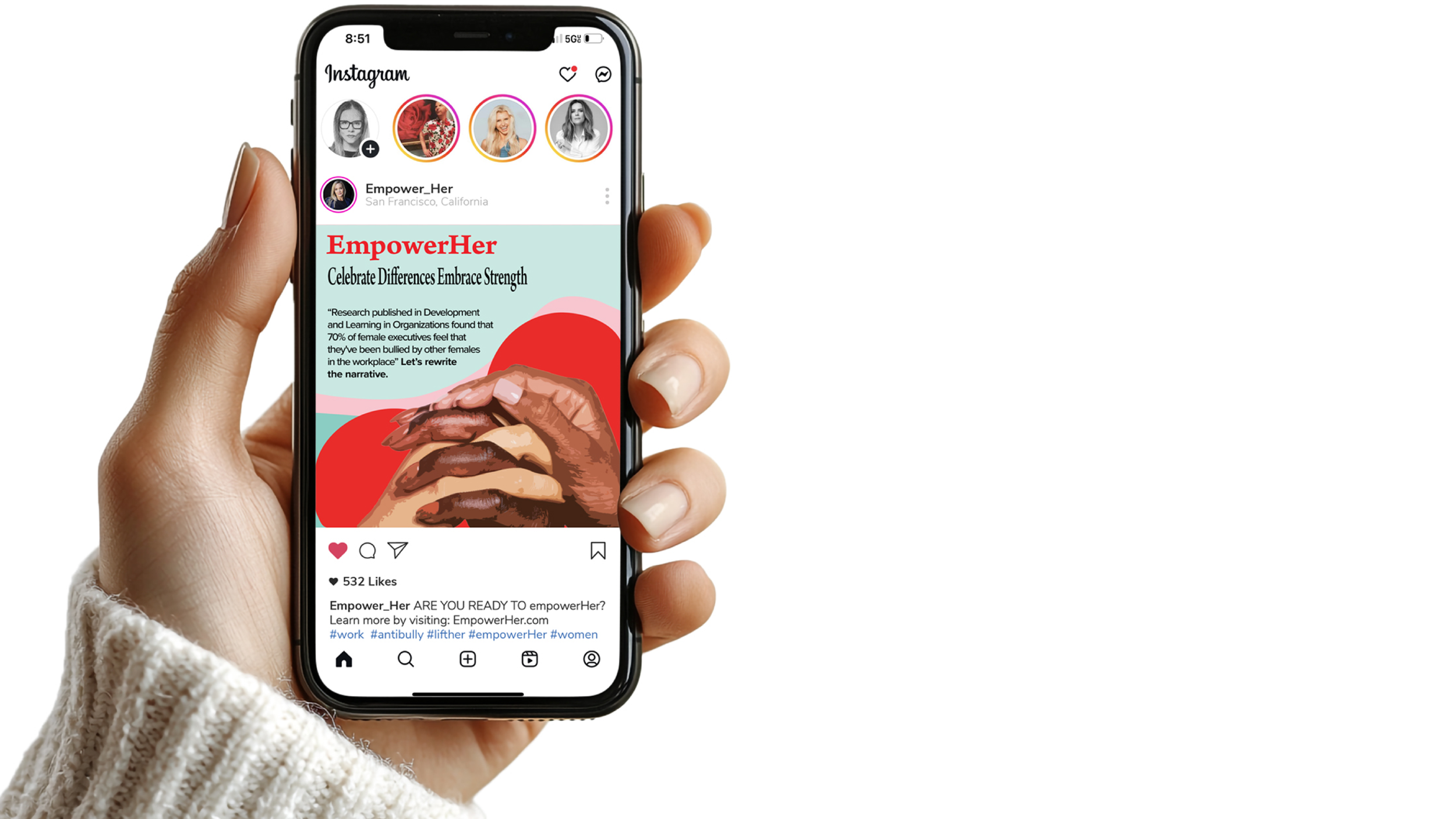
The visual direction uses bold typography, confident imagery, and a cohesive color palette to create a campaign that feels empowering, direct, and approachable. I wanted the message to catch attention quickly, but also leave room for reflection. The goal was not to shame women into being kinder. It was to make the idea of support feel visible, powerful, and worth carrying forward.
The campaign includes a print ad, social media graphic, pins, and a branded tote bag. Each piece had to work differently. The print ad needed to stop someone in the moment. The social graphic needed to communicate fast and feel shareable. The pins and tote bag needed to feel like something someone would actually choose to wear or carry, not just another campaign item with a message placed on it.
That was the biggest design challenge: making the campaign feel like a real visual system instead of a set of matching assets. I focused on hierarchy, spacing, image choice, and message placement so each piece could stand on its own while still feeling connected to the larger campaign.
The final direction is bold, feminine, and intentional without feeling overly polished or performative. EmpowerHer is designed to turn a difficult social pattern into something visible, using design to encourage support, confidence, and a stronger sense of unity between women.
Campaign Assets: Print Ad, Social Media Post, Pin & Promotional Bag